Phone calls
Emphasizing moments of joy and streamlined processes via microinteractions on Apple's watchOS phone calls.
The Brief
The brief for this project required selecting and prototyping a smartwatch interaction focused on microinteractions within watchOS guidelines. I chose to explore the experience of taking and reviewing phone calls, aiming to modernize the interaction and visual design to align closely with current iOS aesthetics. My approach prioritizes clarity, simplicity, and flexibility, reinforcing the Apple Watch as an essential companion to the iPhone, rather than a standalone replacement.
01. The Research
I conducted a detailed flow analysis of the existing phone call interactions on watchOS, capturing every step involved in receiving, handling, and reviewing calls. By documenting each user action and system response, I ensured no functionality was overlooked when redesigning the experience. This analysis highlighted areas where the current flow could be refined for greater clarity and efficiency.
Flow Analysis
One key friction point is the "three dots" menu when receiving a call, which offers only two options: send a pre-typed message or answer on iPhone. These choices feel underwhelming from the immediate context of a phone call and do not fully leverage the smartwatch’s capabilities.
Another key friction point is how the Phone app handles call history details. Tapping the info icon on a recent call opens the full contact card, which includes sub-options to email, use Walkie-Talkie, edit contact details, block, or delete the contact. These actions feel excessive for a smartwatch and introduce unnecessary complexity. Editing contacts, blocking numbers, or managing detailed contact information are better suited for the iPhone, where users have more control and reduced risk of accidental actions.
Additionally, voicemail is separated from recent calls rather than integrated into the call history, forcing users to switch between sections for a complete overview. These inefficiencies make navigation more frustrating and highlight opportunities to simplify the experience while keeping the smartwatch focused on quick, essential interactions.

02. The Approach
To develop a more refined experience, I took a direct approach by annotating the existing call flow and identifying areas for improvement. Not every interaction needed to be changed, but many could be streamlined for a cleaner, more intuitive experience that aligns with Apple’s design ethos. My focus was on reducing unnecessary complexity, improving hierarchy, and enhancing usability without disrupting familiarity.
Annotated User Flow
I drew inspiration from other apps that effectively utilize swipe interactions to improve accessibility and ease of use. Tapping a button requires precision, which can be frustrating for users with larger hands or reduced motor skills. Swiping offers a more forgiving and intuitive interaction, allowing for quick actions without precise targeting.
This is already a widely adopted pattern in watchOS, seen in apps like Mail and Phone, as well as multi-page interfaces. Since swipe gestures are already an established part of the Apple Watch experience, users are onboarded and familiar with them, reducing friction in adopting an improved call-handling flow.

03. The Design
The redesigned watchOS call-handling experience introduces a more modern, fluid, and intuitive interaction model while maintaining Apple's core principles of accessibility and ease of use. The prototype removes cluttered button-based interactions and replaces them with a gesture-driven system that allows for greater flexibility, reducing friction and improving precision.
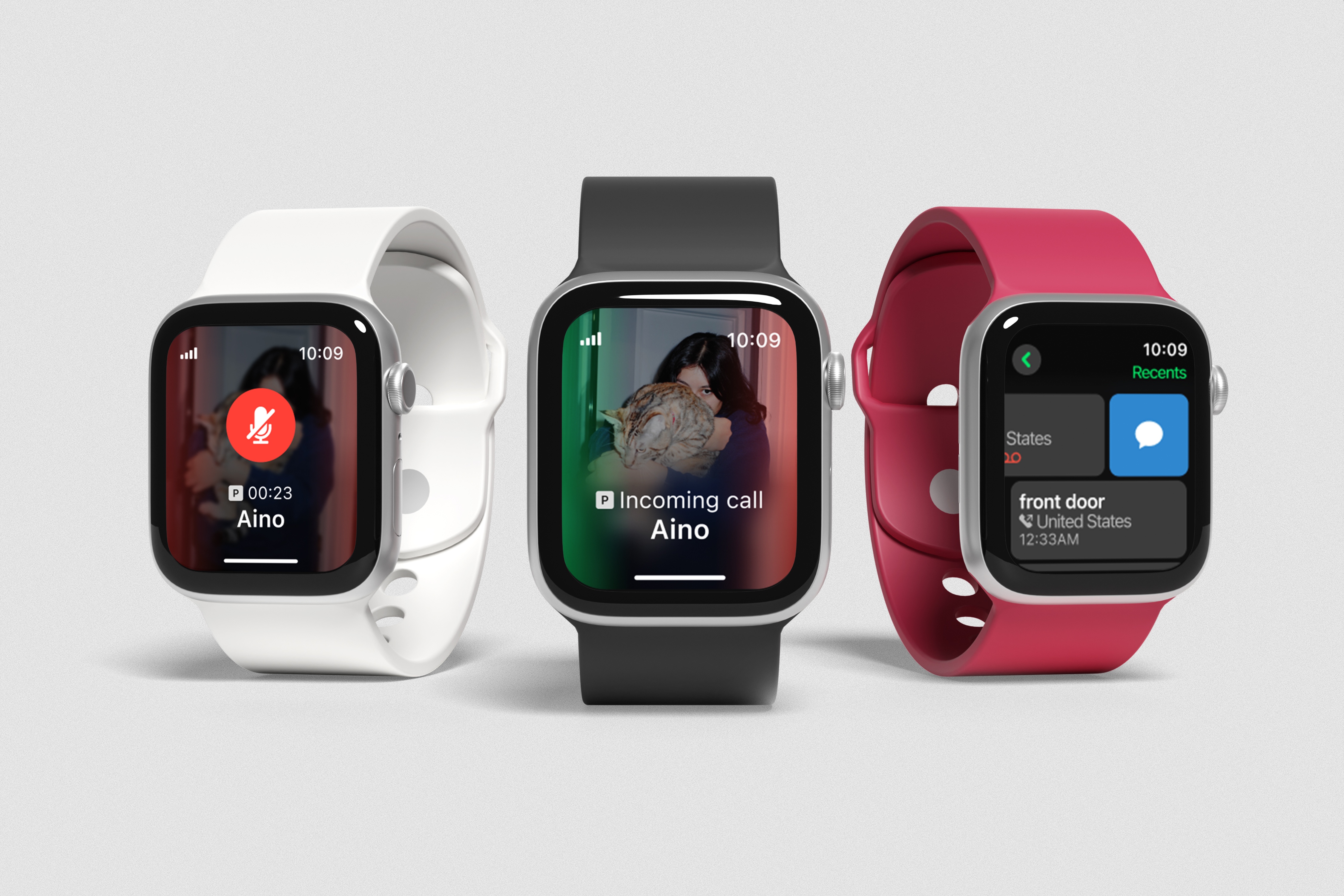
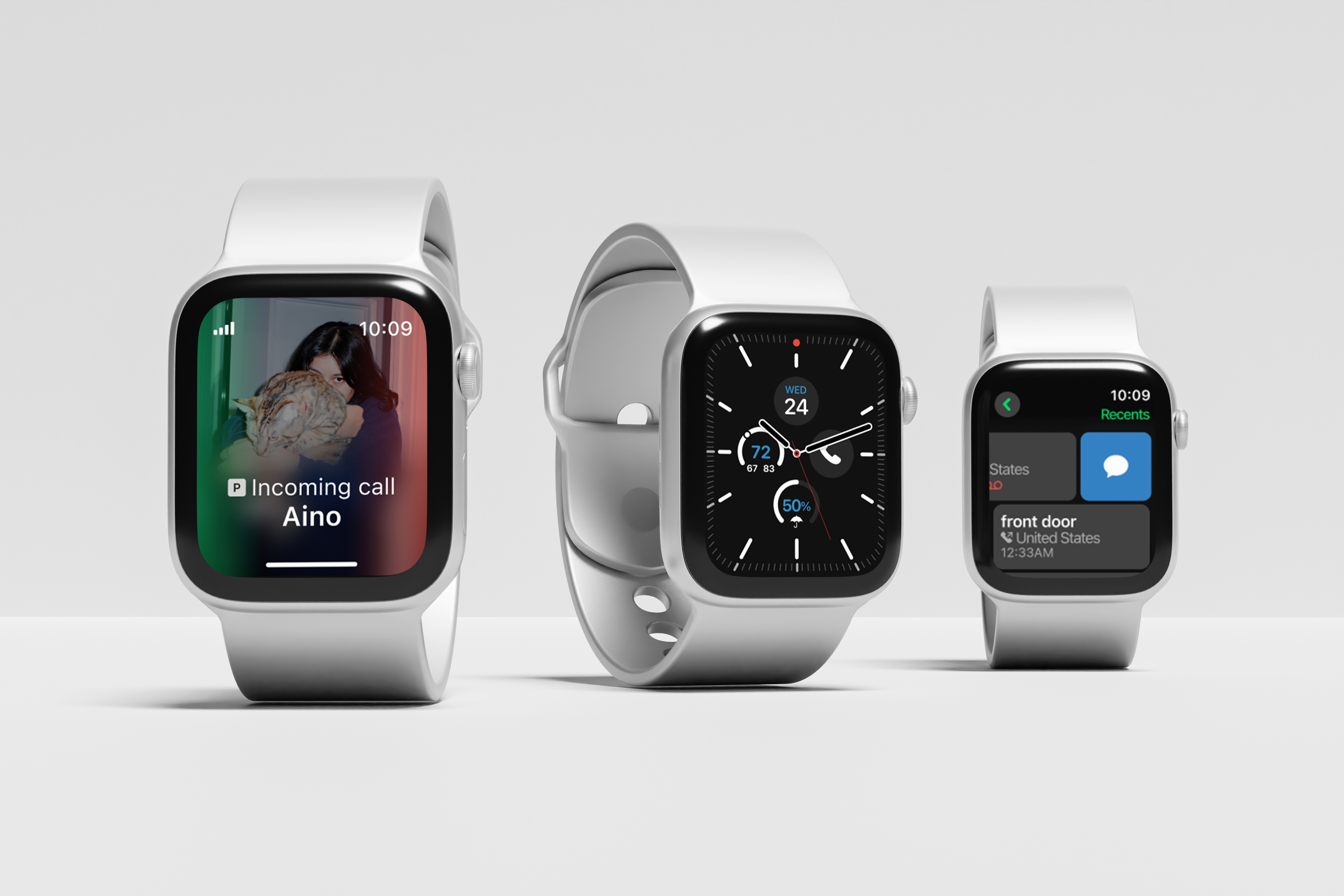
Recieving calls
When receiving a call, the original answer and decline buttons are removed. Instead, the left side of the screen glows green for answering and the right side glows red for declining.
- Swiping left initiates the answer action, displaying the answer icon over the green gradient. Completing the swipe accepts the call.
- Swiping right initiates the decline action, displaying the decline icon over the red gradient. Completing the swipe rejects the call.
While in a call, the mute and keypad icons are removed.
- Swiping left for the mute function: Swiping reveals a blue overlay with the mute icon. Completing the swipe mutes the call, and a central button appears to unmute, ensuring clear control.
- Swiping right ends the call: Swiping displays the end call icon over a red gradient, and completing the swipe ends the call.
Swiping up on the touch bar during an incoming call reveals options such as:
- Send a message to quickly respond without answering
- Answer on iPhone to transfer the call to the phone
- Turn on Focus to activate do not disturb mode
- Silence caller for one hour to mute them without blocking contacts
Swiping up on the touch bar during a current call reveals options such as:
- Open keypad to enter numbers during a call
- Send a message to the current caller without ending the call
- Add a call to start a conference call by selecting a contact
- Move to iPhone to seamlessly transfer the call to the phone
Reviewing calls
Voicemail information is now integrated into the recent calls list instead of being in a separated section, reducing unnecessary navigation and ensuring users can take action with minimal effort.
- Missed calls with voicemails display a voicemail icon, providing a clear visual indicator.
- Tapping a missed call with a voicemail opens the voicemail transcript immediately, allowing users to read, play, or delete the message without extra navigation.
Swiping on call history entries provides direct actions without extra taps, u-turns, and subpages.
- Swiping right on a call entry provides a quick message option, letting users send a text without opening the full contact.
- Swiping left on a call entry offers an instant call-back option, reducing friction in returning missed calls.


